Responsive Web Design
As a Senior UI/UX Designer at WebMD, I designed responsive webpages across a wide range of consumer health topics, translating complex medical content into clear and visually engaging experiences.
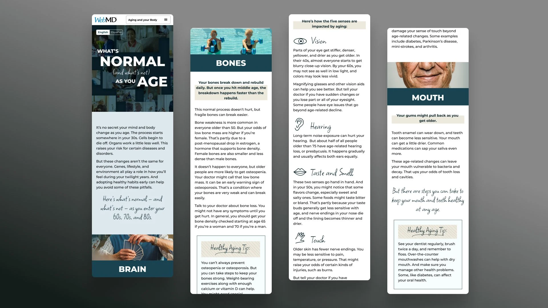
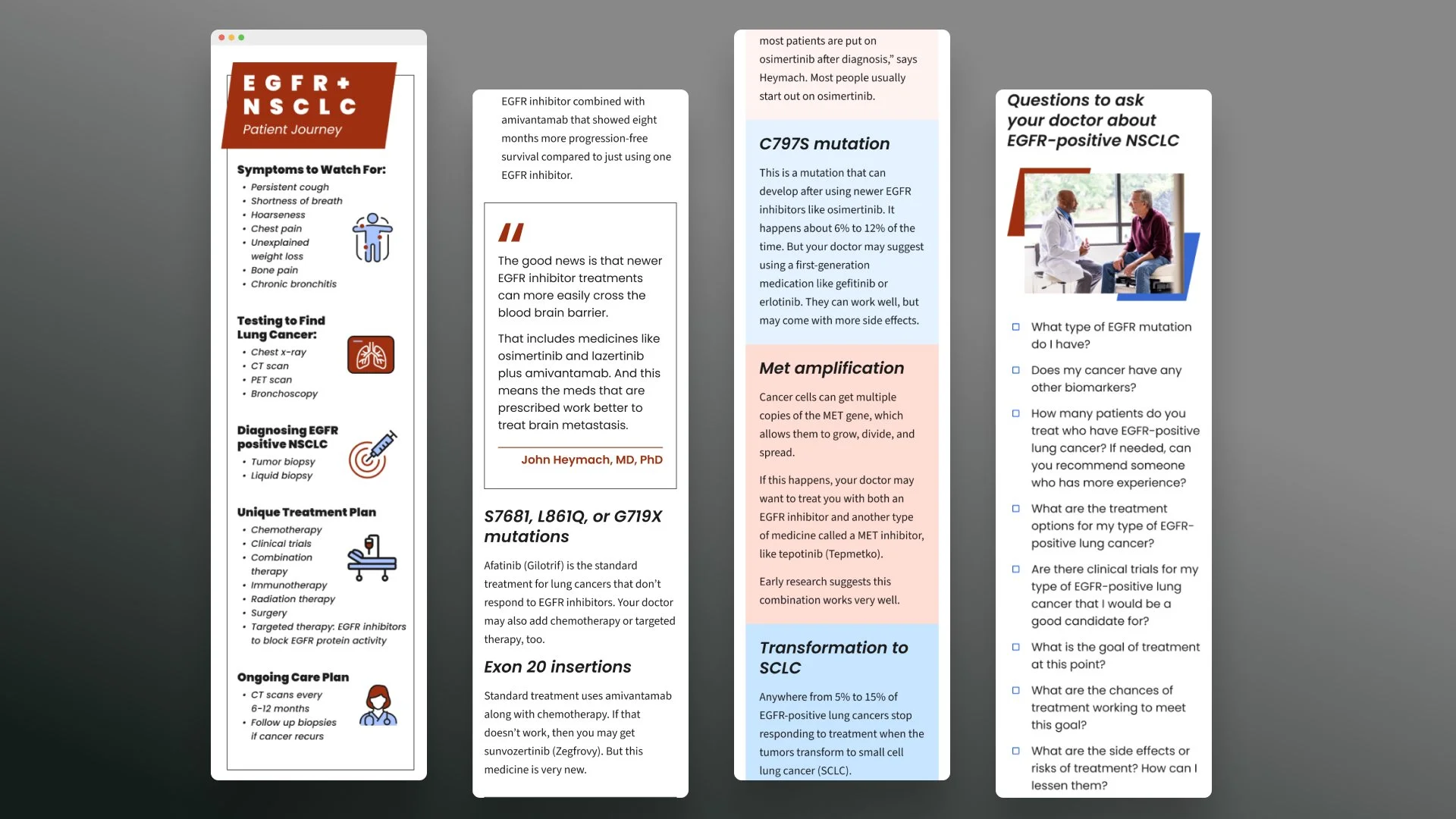
Below are a few examples of my design work (Desktop and Mobile Breakpoints).
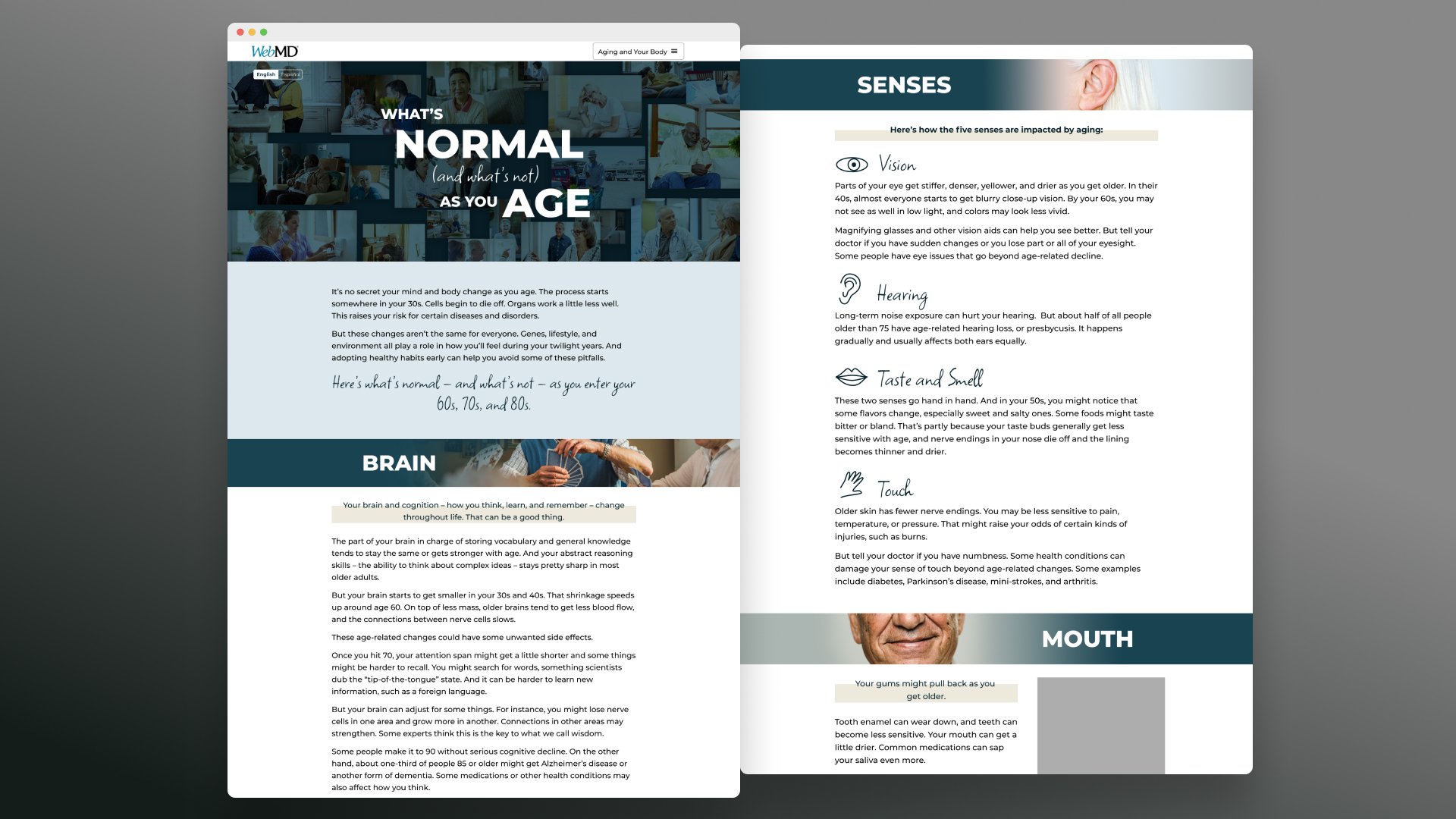
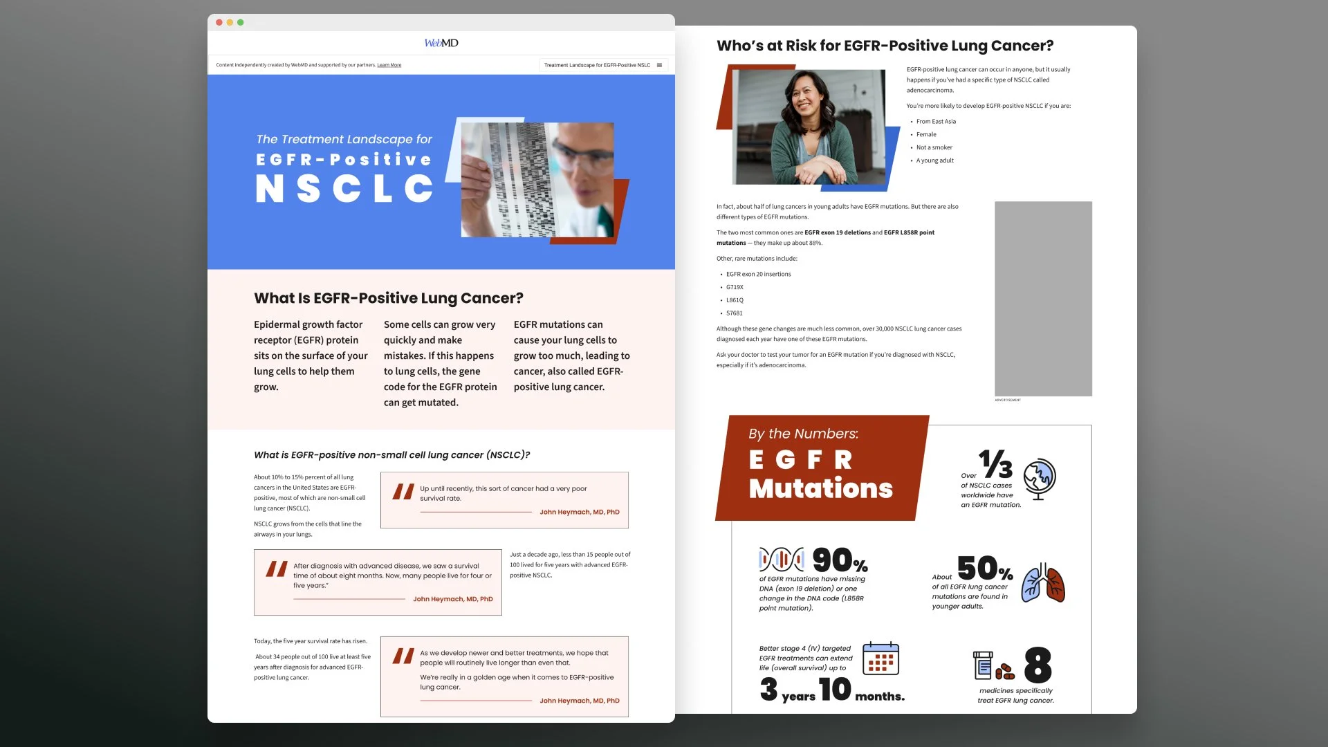
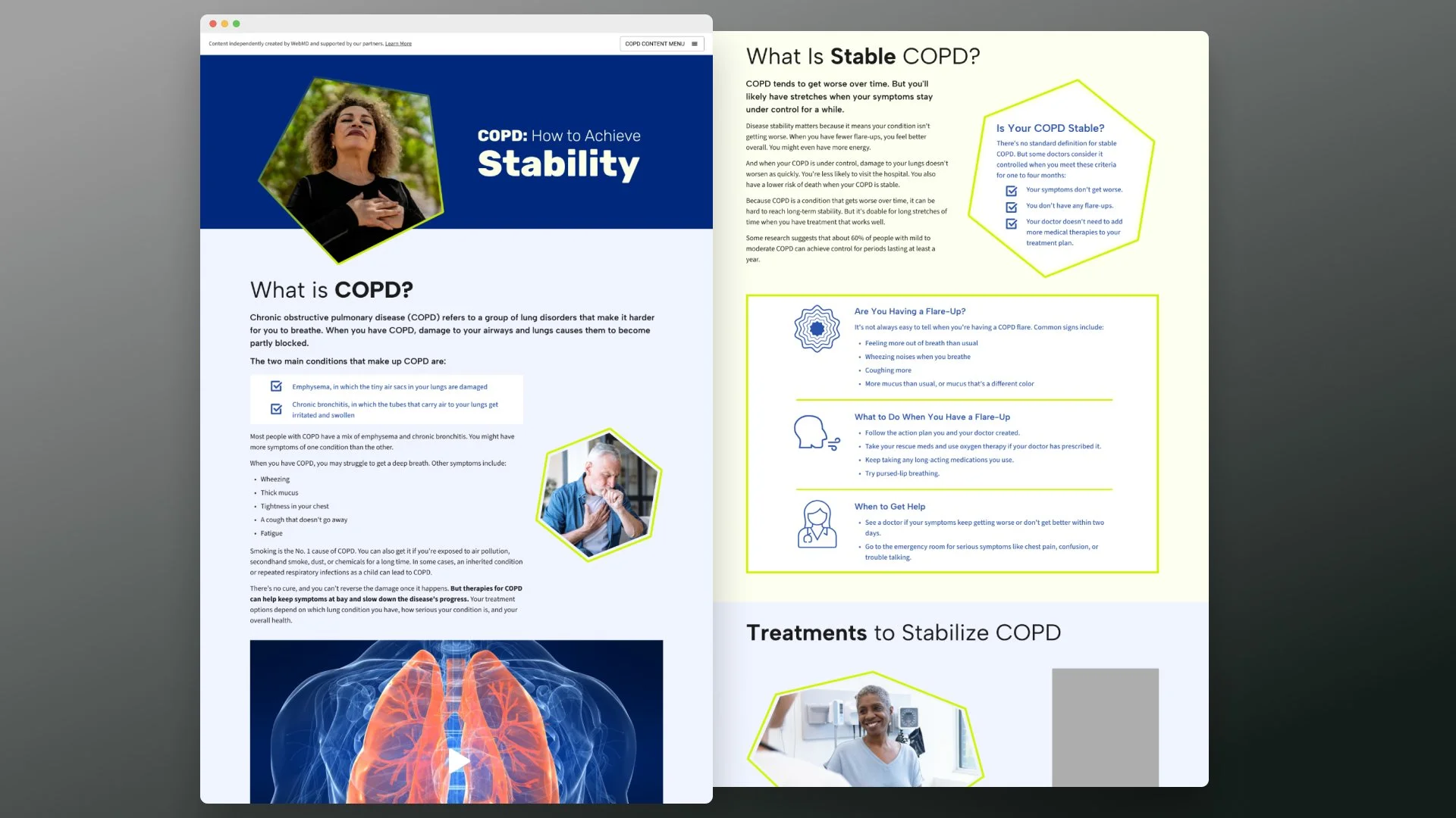
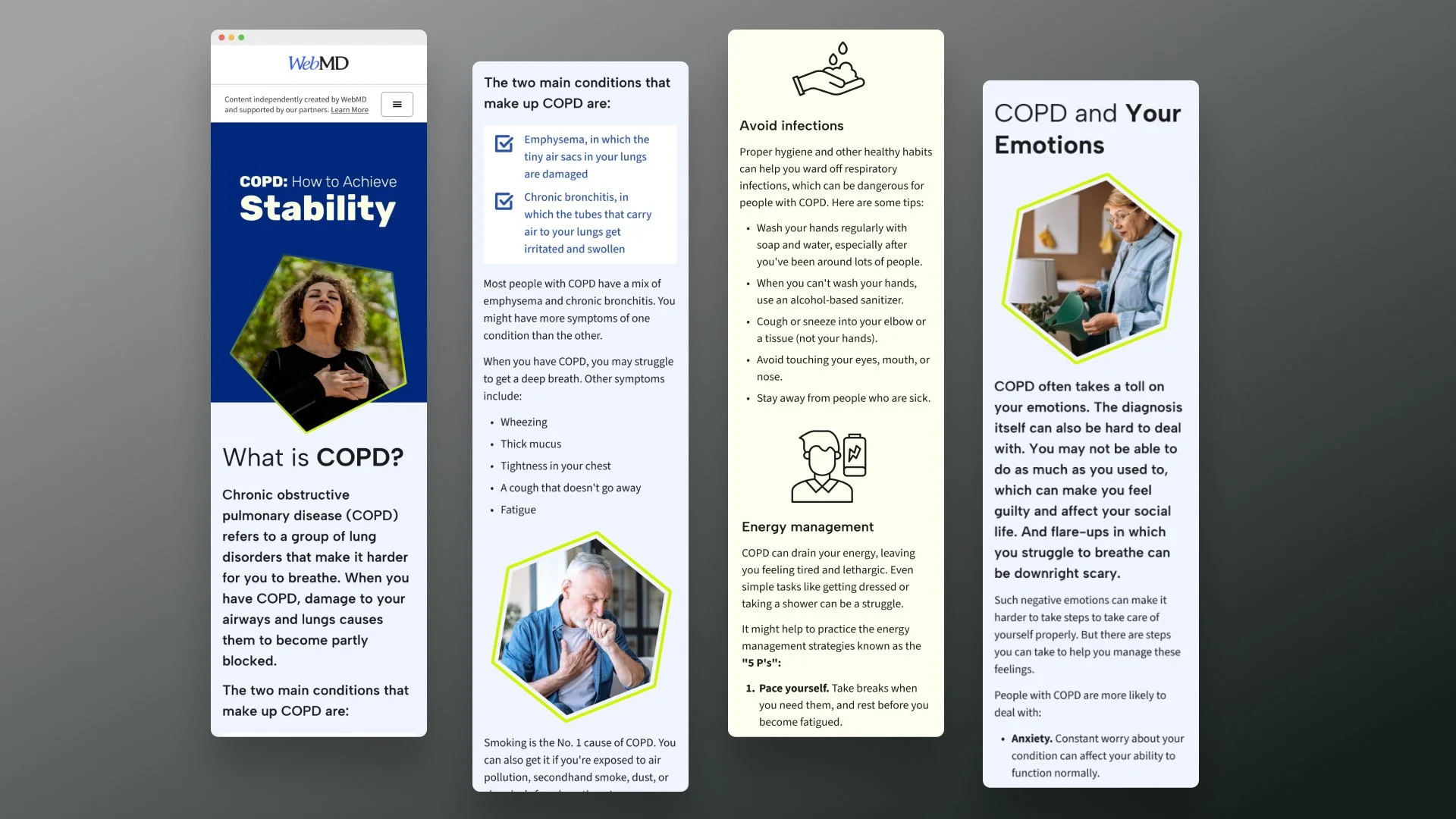
I partnered closely with Editorial to understand the intended audience for the article. I customized typographic hierarchy, iconography and color systems, as well as selected stock photography, and crafted layouts to support topic-specific expression, clarity and levity.
I designed across mobile, tablet, and desktop breakpoints, adapting layouts and components to maintain clarity and hierarchy at every screen size. This included rethinking how elements like imagery, callouts, and content modules stack, scale, or transform responsively. I collaborated closely with developers to ensure pixel-accurate implementation and alignment with design intent, and provided detailed motion and interaction specs for dynamic content loading.
My goal was to preserve comprehension, visual hierarchy, and user trust across contexts through a cohesive system of typography, spacing, color, and component behavior.